Friday, December 12, 2008

jonathan viner


jonathan viner, a discerning youngster, oil on panel, 24"x36, 2008


jonathan viner, conduit of dialogue, oil on panel, 24"x36", 2007

i love jonathan viner's work. it was his palette that first drew me in. the muted, aquatic tones. and then it was the details, the quieter moments, the small peculiarities that i noticed only in my mind's eye as the paintings haunted my imagination later. like the tags on the lamp cord in a discerning youngster, just a simple factor that brings the ethereal scene down to earth. the blue glow of the cell phone screen in conduit of dialogue, an unexpected inclusion of modern technology in a old master style oil painting. i love the contradictory technique and content. it cements the more frivolous aspects of our daily culture in the history that we are sure to leave behind. whether we take them seriously or not, these gadgets will become artifacts of our culture that we will pass along to future generations. things like plastic, radio waves, and computer chips will be the lasting legacy of what our generations have built (check out alan wiseman's the world without us, amazing). rather than making some sad commentary on these trends, i feel like viner's works simply explore this as an inevitability. there seems to be little sadness in these observations, more of a sense of wonder and fascination. 


jonathan viner, the fluidity of power, oil on board, 48"x36"

jonathan viner was born in new york in 1976, and received his BFA from the rhode island school of design. he now lives and works in nyc. since 2002 jonathan has had several prestigious solo shows, including his 2008 show target practice at the jonathan levine gallery. i am particularly drawn to viner's darker images (they're all fairly dark, but some are more fantasy than nightmare). i love watchdogs. viner has an amazing ability to depict architecture that radiates human emotions. i love that the house behind the figure in watchdogs has as much presence as the figure herself, almost as if it is the house bidding her to stand guard. an exemplar of detached observation, is also a beautiful example of a building that seems to breathe (i don't have a big enough image of the piece, so click the link to see an image you can see the details in). 


jonathan viner, watchdogs, oil on panel, 53"x41" 


jonathan viner, an exemplar of detached observation, oil on panel, 36"x48"


Thursday, December 11, 2008

eric beltz: my kind of america

barbara kruger, thinking of you, mixed media, 1999


barbara kruger, your body is a battleground, mixed media


i am obsessed with typography. i love letters, words. i love their forms, their graceful curves and straight-backed uprights. my love of letter forms played a big part in me falling in love with graffiti art and pursuing the interest academically. the first time i got letters tattooed on my skin (albeit greek letters) i was elated by the process of using my own skin as a writing surface. i couldn't believe how beautiful the words looked on the canvas of my skin. i found myself drawn to artists who used typography in their design. barbara kruger, russian constructivists, magritte, william blake. but it's a fine line. when executed well the juxtaposition of visual imagery with written words can be powerful and eloquent. when done half heartedly, or expressing a tepid sentiment, the pairing of fine art and written word results in what essentially amounts to a poorly designed hallmark card. i always had an aversion to art that sloppily paired painting and/or drawing with prose. watercolors of irises with sophomoric poetry about spring showers. it always struck me as ingenuine, as if the words and the design were both too weak to stand alone, and together they only seemed further handicapped by their conjoined status. 


eric beltz, tree of the evil eagle, graphite on paper, 30"x40", 2008

santa barbara based eric beltz easily avoids the latter travesty by imbuing his works with humor, clear articulation, and candid witticism. his politically charged, stunningly rendered graphite works keenly dissect modern political and social anxiety with a sharp sense of satire. beltz' drawings resemble etchings and scientific illustration of the 18th century (another gold star from me) and yet find a sense of contemporary relevance by addressing history as an important indicator of our present. in his series entitled american visions beltz depicts the founding fathers in scenes of defeat, regret and plaintiveness. in tree of the evil eagle washington sits dejectedly before a majestic tree occupied by a malicious looking eagle and a pentagram of text. the chopped lumber surrounding his slumped frame seems to allude to his famous cherry tree anecdote, and perhaps underscores the impotence of honesty as a virtue in politics. in today's day and age, where politicians treat the past like unwanted baggage rather than an important educational tool, beltz' clever indications that generally life's problems stay fairly similar and that we ought to try to learn from the lessons of the past are much appreciated. 

eric beltz, treats breathing problems, graphite on paper, 11"x14", 2006

there is a mystic, mythological element to beltz' work as well. frequent occult symbols and allusions to american mythology and superstition riddle beltz' illustration, such as the pentagram of text in tree of the evil eagle. there is an acknowledgement of the strange and constantly changing history of religion and spiritualism in america; a gentle nod to the american dream and the various ways that it becomes present in our hopes, dreams, and disappointments. he has also done an interesting series on folkloric medical treatments, and at least one piece that reminds the viewer of the positively benign and healthful applications of hemp used by the founding fathers. 


eric beltz, good luck assholes!: thomas jefferson's vision of death, graphite on paper, 22"x28", 2007

and beltz doesn't bother beating around the bush with these issues. rather than veiling his messages in flash and pomp, his clearly articulated style, gracefully utilized passages of negative space, and often bold language practically shout at the near deaf american populace that change is inevitable and disappointments are sure to occur without careful consideration. however, these pieces are certainly not without sensitivity and poignancy. beltz' feather light shading and lovingly depicted flora and fauna, lend grace and beauty to his illustrations. with today's political climate, environmental hazards and never-ending train of scandal and intrigue look for beltz' work to only improve with the ample inspiration. in a society that has a tendency to dissolve into a no-holds-bar shouting match, a level-headed artistic voice with a good sense of humor is extremely valuable. 

Wednesday, December 10, 2008

goosebumps: thomas doyle


thomas doyle, the reprisal, mixed media, 10"x 12" diameter, 2006


thomas doyle, the reprisal, detail

it's no secret that i have a healthy fascination with the macabre. i like things that make me shiver a bit. a healthy case of gooseflesh never hurt anyone. my mother's rather bizarre habit of reading me edward gorey as a child probably helped. she even got me an edward gorey pop-up book. scared the shit out of me, but she seemed to find it engaging. i guess i just didn't get it, but i also used to wonder why as an adult my mom found the pee-wee herman christmas special so entertaining. it wasn't until i watched it again as an adult and saw the opening scene in which pee-wee says that he's having an addition built to the playhouse and opens a door to reveal a room being built out of fruitcakes by heavily oiled construction workers that it dawned on me. my favorite creepy tome my mom would read to me was the edward gorey alphabet book (check this link, great online copy of the whole text), in which each letter is represented by a child who meets an unfortunate end.

when i discovered thomas doyle's mixed media miniatures i felt the same sense of mutant attraction i used to feel scanning through the pages of gorey's morbid alphabet book. there is something beautiful in the stripped bare, painful moments in life, something that is very difficult to describe in words. despite the fact that we all harbor an inherent interest in the darker side of life, we often fear our fascination with grief and loss will be misunderstood. doyle has an uncanny ability to create scenes both disturbing and familiar. these scenes resonate personally with viewers, even though most of us have never had to dig a shallow grave in the woods.

when i first found his site i must have sat and stared for hours. i had to keep viewing and reviewing each image over and over, each time feeling more and more implicated in the scenes. doyle's use of glass to contain the tiny scenes almost acts as a metaphorical seat belt. you feel yourself falling into each scene, getting closer to the emotions that are drawn in the various pieces, and only the device of the protective glass prevents you from full tidal waves of grief, longing or doubt. like an excellent stage director he works with the viewer's heart strings, orchestrating a ballet of disparaging feelings, from hope to isolation and outright fear. doyle explains, "In much the way the mind recalls events through the fog of time, the works distort reality through a warped and dreamlike lens."


thomas doyle, courier, mixed media, 12.5"x14" diameter, 2007

the works, rendered in 1:43 scale, also afford the viewer a sense of power over scenes that one would no doubt feel powerless in were they themselves the figure under glass. in this way we get a chance to spy on the sadder, angrier moments of life - the times when we are helpless and acting on instinct - without a threat of getting hurt. our sense of morbid voyeurism (rampant in a society of crime scene dramas and serial killer fan sites) is gratified in a clinically detached manner; we walk away with clean hands. "Hovering above the glass, the viewer approaches these worlds as an all-seeing eye, looking down upon landscapes that dwarf and threaten the figures within," writes doyle.

contrary to the implied safety of the viewer's position, the intimacy of scale and the inherent beauty of doyle's execution draws the viewer in despite themselves. there is a transition as the viewer approaches the tiny piece, from an inflated sense of security and omniscience, to a shudder of personal resonance. the tiny expressionless figures are a blank canvas on which the viewer can project their own script of emotional responses. not all of doyle's scenes are as dramatic or narrative as say, the reprisal. some of his little worlds seem to capture moments in life that for one reason or another (the way the light refracted off a porch swing, the smell of roses - so saturated that summer) simply haunt the memory, the kind of formative snippets of a life lived that will landscape our dreams over time. doyle says "the works depict the remnants of things past—whether major, transformational experiences, or the quieter moments that resonate loudly throughout a life."

wondrous how such a small artifact can have such a huge impact.


thomas doyle, the occupation, mixed media, 14.5"x18.5"x12.5", 2006

amy sacksteder and i: seperated at birth?

amy sacksteder, ambition, gel pen and gouache on paper, 8.75"x10", 2007

the facts:

amy sacksteder was born in augusta, georgia. 

i was born in eugene, oregon probably a few years later (unless amy is a super genius, which wouldn't surprise me) as she entered university five years before me. 

amy lived for a spell in the exciting city of chicago, which stimulated her artistic influences and planted the seeds of her organic, contemporary "hipster aesthetic." 

i have yet to escape eugene. 

(possible non-fact) amy loves avocados. 

i hate avocados. 

AND YET!

i believe strongly that amy and i may have been twins separated at birth. and not just because i have an art crush and want desperately to believe that a talent as raw and powerful as amy's is genetically encoded in me and as yet undiscovered. 

when i first saw amy's imagery i was stopped dead in my tracks. one of the reasons that i've always been so enamored with art and artists is that beautiful moment when i find an image created by someone i don't know, never met, that speak directly to my heart. a "killing me softly" moment in which an artist's composition seems to be reading your diary entries aloud. having such an experience with a work of art gives you the chance to feel vulnerable and exposed without dictating what you will do with these senses. i love watching people at art museums and galleries, watching for the moment when they see their own heart laid bare, the look of shock, or comfort, or relief that someone understands. 

amy's body of work artfully waltzes from crisp, voluptuous pieces from nature, to stark, efficient scenes of human isolation and dislocation. the first work of amy's that i saw was a piece entitled in all sincerity, an ambitious large scale work populated with sweeping, silhouetted flocks of bluebirds and queen anne's lace, with texturally sensuous passages of lunaria (also called silver dollar plant, honest plant, and money plant). i was so shook by this painting. it seemed to amass so many of my aesthetic interests and influences in one image, as well as creating a sense of nostalgia with the dried papery silver dollars, and the inviting cadence of the bluebirds. i knew i had to see more. 


amy sacksteder, elegy: just like heaven, oil and gold-leaf marker on gessoed panel, 6"x6", 2008

amy's image ambition (posted at the top of this piece) is from a series that she did entitled the beautiful ones. as i was reading about amy, it was a quote about her influences that started to gel my theory of our tragic separation: " I was simultaneously influenced by the natural world and silhouettes, silk-screened imagery on t-shirts in boutiques, tattoos and band tees on hipsters in Wicker Park. " I may not be an expert on wicker park, but that sounds like a list of loves that i would rattle off. it's funny because amy talks about how initially she wasn't fully aware of her "perpetuation of an already prevalent hipster aesthetic," and how it took moving from her neighborhood in chicago and a visit to etsy (artsy-crafty people porn, i'm addicted) for her to become aware of the aesthetic sub-culture she had unwittingly become a hero for. 

i only recently began to accept my own hipster status. having bartended at eugene's notorious hipster bar, indigo district, for awhile i felt sure i'd had my fill of joy division references, bob dylan sunglasses and cowboy tailoring. a couple months ago i went to a house party at my ever uber-hip friend heather's house. chuckling as i walked up the steps about the abundance of "taste-makers" sure to be inside, i found my outfit (coat of arms amongst hipster sub-sets) an instant hit. it was showing up at a hipster party in skinny jeans, black stilettos, and a t-shirt with two girls in bikinis and boxing gloves covered in blood that cemented my grudging understanding that i am a indeed at least part hipster. like it or not. 

in the beautiful ones amy seeks to "understand the why behind hipster, rock kid, art kid- sanctioned images." she takes an interesting conceptual approach to try to puzzle out how particular images become iconic facets of hipster visual culture. amy explains, "I am interested not only in the preference of certain animals and imagery over others, but also in the process of appropriation---the distance that an animal must travel from its source in the wild, to its translation into slick silhouettes and layered silk-screened images, to its subsequent marketing and distribution; from an individual living creature to a ubiquitous symbol."

with her accomplished technique, thoughtful compositions and her broad intellectual curiosity amy sacksteder is a talent to keep an eye on. she is currently an assistant professor of art at eastern michigan university. she has two solo shows coming up in 2009, The Beautiful Ones, at the Arrowhead Room, Waubonsee Community College, in Sugar Grove, Illinois and still at the paint creek center for the arts in rochester, michigan. she has also expressed possible interest in putting a couple pieces in my upcoming menace to propriety group show, so i've got my fingers crossed that it will happen. she just happened to pick the four pieces i would have hand selected given the chance (it's that twin psychic connection). if amy's work makes it out to the show you'll surely hear me bleating about it for weeks, so keep your ear to the ground for a potential upcoming NW visit (of at least her work, if not her busy self) from the beautiful ms. sacksteder. 

Wednesday, November 26, 2008

george bernard shaw


"i am of the opinion that my life belongs to the community, and as long as i live it is my privilege to do for it whatever i can." 

-george bernard shaw
1865-1950

Thursday, November 20, 2008

"intuition" installation series with mark lammi

(mark lammi, in front of one of his glass pieces at fenario a few months ago)

our new show for december is going up after the shanna and rainen show comes down next weekend. we've got local glass artist mark lammi coming in to present a series of multimedia installations featuring his award winning glass art. Lammi's glass pieces are a study of form and line, and his constructions offer diverse views of these influences. He is known for his deft handling and ability to create strikingly delicate goblet and vessel forms, often influenced by classic Venetian design. Lammi says, "As an artist I've found borosilicate glass to be a medium unlike any other. There is a quality of intimacy between the glass and the artist that I find incredibly appealing."


the bridge + quick and easy boys benefit...

(men being men)

rocked the spot. 

thank you to eugene, and the larger oregon/blacksheep family for coming together to pull off two nights of fun, funding and foot stomping this weekend at the gallery. with special guest the bridge and portland rockers the quick and easy boys, the music was on point and the dancing non-stop. with the help of the silent auction, the venosa print raffle and holly and nate slangin' drinks behind the bar we not only ended up feeling loved, but managed to raise enough money to at least keep our heads above water for awhile. it was really touching to see how people banded together to help the gallery. many of our friends took it upon themselves to help with the promotion, and i heard a few people mentioning to one another the importance of saving a spot that's brought so much joy to the community. it felt really good to get such a positive response. 

in the end it wasn't about money, it was about having the chance to witness first hand the love and support of our friends and community. it makes all the rough days worth it. 

the only crack in the icing on the cake was a few idiots who wouldn't accept a gentle send-off at the end of the night. no accounting for bad manners. unfortunately the incident seems to have caused one hooligan to go off the deep end far enough to come back to the gallery at 6AM and break the front window with a pair of pipe wrenches. luckily my friend zack was kind enough to come and spruce the window up a bit.

 
(come by in the next couple days to see this shit in detail, the figure bending over is a cop, complete with walkie talkie, too fucking funny.)

compound gallery + upper playground

(upper playground, 5th and couch, portland, or)

i was recently in portland to see the my friends' band play and got to spend some time perusing art in downtown portland. my friend is from the east coast, land of uninspired apparel, and wanted to pick up a sweatshirt at upper playground. i was on board because i'd yet to visit the urban clothing mecca, and was pumped to see the gallery space i'd heard so much about. its a small space, but efficiently used, with lots of natural light and an amazing amount of pull in the west coast art scene. they get artists that i would give my left pinky toe to show at fenario. their current show, "from the desk of whatserface," features art by mel kadel (who's work i hadn't seen before but instantly fell for), travis millard and michael sieben. i also picked up a great t-shirt and flirted mercilously with the sales girl. good times, good times. 


(compound, 5th and couch, portland, or)

we then strolled across the street to compound gallery, where the brightly colored scarves drew my in like a magpie to tinsel, only to paralize me with fear with their price tags. the upstairs gallery space was a pleasant surprise. the first room was full of prints leaning on the walls like presents under a christmas tree. i was stopped dead in my tracks (and the further poached with jealousy) when i saw an original jen lobo painting of a jellyfish and it was explained to me that jen is a good friend of the manager, and the pieces were created for him for various shows he curated. holy shite, i want that man's little black book. they're having an art sale in mid december which i will not be missing. when i get the details, i'll post them. if you're in the area get your ass down there, because this guys collection is hands-shaking good. 


(jen lobo, the devil whale, oil on wood, not the piece i saw at compound, but one of my favorites)


best of eugene

(oh god this tattoo is awful, surely its photoshopped, but let's hope for the model's sake the tribal tramp stamp is faux as well. because in amerindian that shit reads "musty hooker.")


well, well, well...

fenario gallery with the win. each yeah, our local "alternative" weekly paper opens ballots for the "best of eugene" awards. though the results are heavily fixed by the primarily extreme-lib readership of the rags, its still a good indicator of what people like in eugene. it is fenario's pleasure to share that we won best art gallery this year. in the write up EW wrote:

"Wow. Fenario in an upset! By the way, y’all, it’s prounounced Fen-AIR-ee-oh. Or so the proprietors told us back before the gallery at the corner of Broadway and Willamette became the place for hip multiculti art, spoken word and the occasional DJ. Sometimes appreciating the art at Fenario calls for special brownies rather than wine … not that we’ve got a problem with that. Pop in to get something framed or land at the gallery for one of the benefits it sponsors — and stay for the art. Runner-up DIVA usually features local artists but hits it outta the park with the Teenie Harris show this fall, and besides, there’s usually a movie or experiemental noise band to liven up any unlively art." 

there were mixed feelings amongst the fenarions about the "special brownies" comment. some felt that it was a dig, and that it was meant to make us feel like lazy stoners that barely deserve the win, but i'm in another school. i think the writers at the weekly just think making snarky little comments like this make them sound cool. you know, "hey kids, i'm down with the pot! i'm hip, i'm with it, tucka tucka tucka tucka..." oh well, let them have their fun. 


the best of eugene awards are given out at a sort of oddly choreographed, low production value extravaganza, this year hosted at the mcdonald theater with a halloween theme. costumes were encouraged, but i skipped out. i got caught somewhere between history teacher and disco minx and had to run out the door. in retrospect is was a very foxy, if a little confusing, get up. we were honored to receive the award, but no one was too keen to be the one who got up onstage to accept the plaque. in fact, when our name was called we were all milling about in the bar. i refused to set down my drink to exit the bar, so for a few painful moments i squinted up at the screen showing the stage, willing someone to take one for the team and get up there. fortunately at the last minute brent and mikl made it to the stage and awkwardly claimed our prize. 

afterwards we went to a sad bar with an empty dance floor and drank our joys away.... JUST KIDDING! ... except that i'm not.

Friday, October 24, 2008

November Fenario Art Show

shanna trumbly, the rabbit and the shooting stars, acrylic on canvas

This Novermber at Fenario Gallery we'll be having a joint show with local artist Shanna Trumbly and a Portland-based photographer named Rainen Janes. Shanna and Rainen have been friends for years, but this is their first time showing together, and I'm excited to find that I think their work, despite their very different mediums work together very well and have an interesting give and take. Shanna has been active in the art community in Eugene for years. She has a popular booth at the Saturday Market, and her shop at the Country Fair this year had lines pouring out into the paths. While her art had been mainly focused on craft and mercantile, Shanna picked up a paint brush about a year ago and found she had a virtuosic natural ability with the medium. Producing several whimsical, dreamy scenes often depicting animals and local flora over the past year, her more recent works hinge on a new technique in which Shanna takes a photograph which she has printed on canvas and then paints bright, juxtaposing images over the photo. Her benign animal scenes have taken on a distinctly darker flavor, and though there is still a fairy tale like narrative element, they are more like the Grimm Brothers' original stories than Disney classics. 

Rainen Janes' captivating nature photography (similarly printed on canvas) will make for an interesting artistic olio when hung with Shanna's acrylics. A gifted photographer with a strong sense of form and color, Rainen's series for the exhibit will focus mainly of photographs of horses. With interesting angles and the inclusion of unexpected depictions of the theme in far flung locations hand picked from his travels, the exhibit will be an interesting twist on a nature photography show.

Upcoming show with The Bridge


its that time of year again, kids. one of our favorite bands is slowly making their way out to the left coast to get willamette valley booties shaking. they're playing two nights at the gallery here's the press release i wrote, generously edited by kevin over at hyena records who's taken a bit of his own time to help hone my press release writing skills:

The Bridge is a Baltimore based band delivering a classic Americana sound fused with elements of New Orleans funk and jazz, delta blues and bluegrass. With their accomplished musicianship, unique instrumentation and intelligent yet accessible songwriting the band has been amassing a devoted following across the U.S. through their dedication to high quality performance. On November 14th and 15th, Fenario Gallery will be hosting a two-night engagement, one stop on the West Coast leg of the band's album release tour. Their new record, entitled "Blind Man's Hill," is an evolution on the band's well-developed, multi-layered sound. The album seamlessly flows between musical styles and tempos with a natural cohesiveness and grace, and has the lightheartedly nostalgic feeling of an homage to the kind of classic American music that remains relevant for its skill and thoughtfulness rather than its glitz or synthesized presentation. "Blind Man's Hill" paints a picture of an America that is composed of rough hands, honeysuckle, whiskey, beautiful women and hard work. The delectable recipe of Kenny Liner's mandolin and beat-boxing, Dave Markowitz' bass guitar, Patrick Rainey's sax, and Mike Gambone's kinetic drums make for a perfect backdrop for Chris Jacob's powerful, singular vocals and gritty guitar riffs. While their studio recordings are undeniably well crafted, the bands real magic comes out in their energetic live performances. Both engagements at Fenario Gallery will start at 9:00 PM, and tickets will be $10.

i have a tendency to be overly verbose, which isn't a very good quality for publicity. concise is the name of the game in the press world. i appreciate trying to build this skill set because i've always had a deeply held admiration for writers who can be impressively descriptive in a short hand manner; the least amount of words representing the largest of human ideas. 

anydoodle, the shows are sure to be great fun. we always have a blast when the bridge comes to the gallery, and with their killer brand spankin' new album they're sure to have the verve and excitement to put on an amazing show. 

Thursday, October 2, 2008

take a ten minute journey with me

fuco ueda, sprouting 2, acrylic on cloth no wood


last night i was meditating on how beautiful Yellena's show is. she arrived yesterday with the whole show, new works on paper as well as gorgeous acrylic on board pieces. as we were unpacking the boxes, i again had a feeling of being artistically overwhelmed. how does so much beauty come from one small, lovely woman? as we laid out the pieces on the floor i was overjoyed to see the kind of show i had been dreaming about mounting since art school. Yellena has cleverly framed her pieces in white shadowboxes. on the white walls of the gallery it has a crisp, clean aesthetic that just sings. the shadowboxes give the show the feeling of an aquarium, each little scene has its own habitat, its own environ, and the small scale invites the viewer into the details, as if approaching carefully curated microhabitats. 

i think having the "stasis" show, with its quiet subliminal beauty, directly following the veritable cirque du soliel of lopez's show will show fenario's versatility. i think both shows are in the direction that we want to go: contemporary, versatile, inherently aesthetically interesting, and youthful. they represent the kind of talent that i want to highlight with the space. people with a signature style, but with an ability to adapt and evolve to challenges and changing times.  i think that people who were present at the last first friday are going to be blown away by the transformation of the space. 

for those who were wondering, the lopez installation will remain for at least this month. let's just say we're attached. (read: i had an anxiety attack contemplating the process of whitewashing the beautiful piece of art myself and several others had done so much to make happen.) 

last night while thinking about art, i was participating in an exsercise that i often undertake: mentally curating a dream show (possibly a self-indulgent act for someone who's already been so lucky in real life, but what can i say, i'm a hedonist). sometimes i think of shows that i would put together just for beauty's sake: no particular concept or theme, just things that i find beautiful. below i've put a list of pieces that i would hang in my show "a few of my favorite things". i'm not normally in the habit of posting images from artists who i haven't spoken with directly to get permission, but i'm hoping that the fact that they're in my dream show will give me some karmic respite. if any one (artists or readers) has any objections feel free to let me know. 

fuco ueda, bad summer, acrylic and modeling paste on cloth on wood


laurie hogin land of desire - prozac planet 2007 oil on canvas 36"x48"


doremus scudder, rock formation, oregon coast silver gelatin print
(we have a stunning set of scudder prints at the gallery that i would love to find a home for)

audrey kawasaki, minami no uta


josh keyes, dawn


walton ford, falling bough watercolor, gouache, ink and pencil on paper

tara donovan, colony, pencils


nicola verlato, enduring freedom, oil on canvas


anne hardy, drift, daisec mounted c-type print


jen lobo, jealousy


audrey kawasaki, if only you were here, acrylic on wood 


Thursday, September 25, 2008

re-post: the lovely yellena

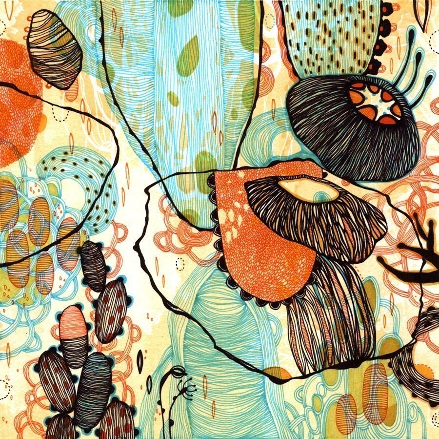
Yellena James, "Vessel", print of drawing done with pens, ink and markers on paper, 6"x6" (print available on her etsy shop)


i've been gushing for quite some time about yellena james. she's a talented aritst and designer who lives on the oregon coast (currently... she misses the city, i can empathize). orignially from sarajevo, yellena has traveled the world honing her beautiful, dreamlike style of illustration and racked up a laundry list of fans. i've got pages and pages worth of praise for her art, but as I mentioned earlier, the heat has turned my brain into mush. for today i'll let the interview and the images speak for themselves. she's agreed to a show at fenario in october, so i'll have plenty more to say in the coming weeks. yellena sat down and answered some of my questions after a recent trip to hang a show at giant robot in san francisco.

CG: tell me a little about yourself, and how you got started making art.

YJ: i've done art as long as i can remember. i hear this from a lot of artists in interviews, but it's true. i always loved to draw and i have always been fascinated with pens and markers. my sister is also an artist and we used to make things together growing up. during the civil war in sarajevo, i enrolled in an art high school against my parents wishes. where i am from, as most places i'm sure, artists tend to starve. but we all at some point make the decision that doing what you love is most important.

CG: where do you draw your inspiration from? what gets your imagination running?

YJ: oh, this is always the hardest question for me because it is very hard to pinpoint inspiration. i think artists just have that in them. if you love what you're doing you are always inspired to do it no matter what. you get inspired by all things. many of my recent works were inspired by small elements or ideas found in my previous works which begged to be explored furthur. it's a nice feeling to finish a piece and step away with the direction in mind for a new piece.

CG: you have a very distinct, recognizable style of design and illustration. how has your aesthetic developed over time?

YJ: thanks for saying that. a lot of work and time have gone into creating and developing my style. i still feel like there is so much more room to grow. i've had a lot of traditional training, and many great teachers along the way. i had one teacher in sarajevo who made us do line drawings for months until we perfected them. i was so happy when we finally started doing some shading in our studies. i think i started doing my best work when i stopped trying to impress other artists, teachers, critics, etc. and started making art that i enjoy.

yellena james, "bliss" pen and ink on paper, 6"x7.5"


CG: do you doodle when you talk on the phone?

YJ: no, i usually pace around the room when i talk on the phone. when i'm drawing, i'm completely focused on what i'm doing. i almost always have music playing. i'm completely addicted to pandora.com.

CG: do you have a favorite medium?

YJ: pens and markers are still my favorite, although i do love paint. i have literally hundreds of pens in my studio and i am very particular about paper too.

CG: it seems that a lot of your pieces are on a small scale. what draws you to working on small pieces? do you ever work on a larger scale?

YJ: i work in a small scale because my work is so detailed and it takes me forever to finish little pieces. i also like the intimacy of smaller pieces. they invite viewers for a closer inspection, a second look.

CG: you recently moved to the oregon coast. as a native oregonian, i must say, you've picked a truly beautiful, scenic part of the world to call home. how has your change of scenery inspired you? do you have good tide-pooling near your home?

YJ: it's true, oregon is very beautiful. the tide-pooling is top-notch i'm sure. the coast is a great place to work in peace, though i'm definitely missing the city energy these days. we'll probably be living in portland by the end of the summer. there are a lot of creative people there and always something fresh going on. we live next to the ocean right now and i guess that has had some influence on my work. recently, my artwork has been described as resembling precambrian ocean life. i liked this, because during the precambrian era, the seas were just these big pools of potential, and life was just forming - seemingly at random but also by design. all these little elements were taking form and coming alive on their own. this is similar to how many of my art pieces come together. lots of little bits and lines, forming curves, then shapes... sort of randomly, but also by design.

CG: what fellow artists and designers do you admire? who do you have your eye on?

YJ: oh, let's see. i'm a big fan of julie mehretu and matthew ritchie... i also really like apak, sam weber, jeff soto, takashi murakami. there are so many more... i think now is a really exciting time in art. one thing about being close to portland, and also selling on etsy and the giant robot, is that i've been introduced to so many amazing DIY-minded artists. there are just a lot of people right now who are doing things on their own.

CG: what albums do you take with you when you go on a road trip?

YJ: for road trips, i like to bring compilations: interpol, black keys, beck, okkervil river, b.r.m.c., my morning jacket, muse, ours, the shins... that kind of stuff.

CG: if i loaned you my private jet where would you go?

YJ: i have been wanting to visit sarajevo and the adriatic coast lately. it would be nice to see my family there, and show my husband where i was born. then i would probably ask you to loan me your jet again for a trip to japan. then italy, then france, australia, ireland, brazil.... your jet will probably need an oil change when i'm done.


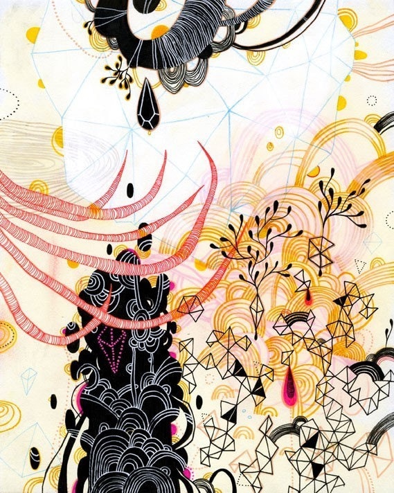
yellena james, "magic" print of drawing done in pen and ink, 8.5"x11" (prints available on her etsy shop)

Thursday, September 18, 2008

california roll

yellena james

there's really no time to rest on one's laurels in this business. as much as i'd like to have the time to sit and revel in the success of the lopez show, i have to give my full attention to preparations for our next show, which hangs in two weeks (ahhh!)

next at bat we have yellena james, who i've been writing about for months now.  i got an email from the artist hesitantly naming the show "stasis". i love the title so much with the work i've seen thus far i'm going to run with it. i have my graphic designer working on a flier (i know, WAY late, it was a opportunity for me to learn to keep my sight on the horizon and never get too caught up in the present, so as to forget the future). i'll get my press out soon, though unfortunately, with this short of notice it would be unfair to ask any press junket to work on a feature story with so little time, maybe we'll get some press retroactively when writers get the chance to see yellena's work and fall in love with her gentle, personable self. 

i'm very excited to see what comes for the show. yellena usually works on a precious scale, but for this show she's produced some larger works, and we're making some large scale prints of her highly detailed work. i am stoked to see how they fill the space. 

i talked with a woman the other day who referred to the gallery as "male-centric". the thought had honestly never crossed my mind, but when i thought back on the past few months i could acknowledge a slightly more masculine energy to the place. we focus on bold art, by male or female artists, but the divergence from a typical decorative presentation makes for a strong presence, which i guess this person read as male. all my co-workers are male... not sure if that really makes it a "masculine" gallery. a couple of people made comments about graffiti being a male art, which made me want to crawl out of my skin. there are plenty of talented, revered women in the graffiti art scene. its about annonymity, about making a name for yourself that transcends the person you are in the day to day. many female writers go unrecognized (as female) because they refuse to make a fuss over whether people think they're a guy or not, as long as their work is being respected. if you're interested in the feminine presence in graffiti art there's an amazing book that i first saw at the whitney museum in nyc called graffiti women: street art from five continents by nicholas ganz that is not to be missed. (i love you reminisce! you are a fucking ninja goddess). 


yellena's show is my "girly" show. not that i think that art ought to be gendered, or that the show will be inherently feminine because the artist is a woman. i call it my "girly" show because the vibe of the art lends itself well to a classy, sensual presentation that may just have a slightly female energy to it. i loved the lopez opening. i had so much fun, and i'm a tomboy who loves beats, breakdancing and whiskey en mass. but i'm relishing the opportunity to have a new kind of opening. i'm hoping to have a wine tasting, maybe some live jazz and i'm planning on bedecking this space with flowers (and possibly balloon art, check in with me next week, i know it sounds wacky but it could be really conceptual). i have a skirt that i could never wear anywhere but yellena's opening. my mom found it at an estate sale. i'm not sure where it came from, it may have dropped out of heaven. its a high waisted skirt made of PAPER (kid you not) and hand painted with taxonomical drawings of exotic butterfly species, not to mention the clumps of vintage rhinestones. it must have been a stage costume or something. with a little perfume , some stockings and pin-curls by my friend dawn, i'll have a real girl night... then i'll wake up the next morning with a rats nest on my head, a potential hangover and want my jeans and grubby hooded sweatshirt back.