
i love patrick haemmerlein's work. it speaks, with a gritty urban voice, to the beauty of simplicity. not simplicity of composition, as haemmerlein's works are often explosive, multilayered mixed media melees, but simplicity of intention... clarity of verse, certainty of voice.
a move to los angeles in 2000 led to an "obsessive photographic cataloguing of the city" that created a foundation of imagery for haemmerlein's developing interest in graphic design (quote from artists' site). the artist is at LEAST a double threat with his superb photographic eye, and his ability to eloquently apply those images in more complicated, urban inspired designs (who knows, he might be an amazing character actor too. triple threat potential for sure). in most cases, rather than mining the depths of communal imagery, or worse, as some choose to, plundering other photographers' work and justifying the theft with a shield of "artistic license," haemmerlein produces his own imagery from the ground up. i have an enormous amount of respect for haemmerlein's multiple talents, and the seamless manner with which he integrates them.

above is an interesting side by side comparison from haemmerlein's site. on the left is the original photograph the artist took, and the right is the completed amalgamation. the photograph is lovely on its own, well composed, good lighting and direction of the subject. i love that the final piece is unexpected. the photograph is sort of softly glamorous, and while the design image retains the woman's engaging gaze, the composition takes on elements of toughness, disorientation and fantasy. the woman in the picture becomes a creature of the city, a natural urban native whose own body sprouts infrastructure.
the ny native's work is kinetic. the images leap from the page with youthful exuberance. behind the busy, often glutenous compositions are clear, concise messages of community, identity, and a call for compassion in the urban jungle. with a distinct graphic design aesthetic, haemmerlein's works read like headlines. they are bold, arresting and can elicit a gamut of emotions from shock to joy, and even that particular strain of shame that results from having the truth dumped in front of you and being forced to look it in the eye and acknowledge its presence.

haemmerlein has done many images, like the two above, that record in a sort of archaelogical manner the synthetic detritus of the living city. these works remind me of kevin cyr's cars and trucks, in that they imbue nonliving figures with personality, grace and a hint of nostalgia. i love that the compositions, though focusing on dominant machines, contain allusions to the city as its own ecosystem. small trees germinate from the underbellies of slick american motor vehicles, constant, persistent reminders of the natural world that we are all connected to; a mother nature that is too resilient to ever be fully buried under concrete.

haemmerlein's work is multilayered in several ways. the intended messages of the pieces are complex and easily open to various interpretations. the city is a system, and everyone has their place. a resident's reaction to the pieces of the city haemmerlein records will vary depending on which nitch that resident resides in. new comers to the city may still find their heart breaking at the sight of an earnest eyed homeless man with dreams in his stare, but those who have been exposed to the callousness for longer may already have their blinders on. for those who have (arguably) had to steel themselves to the ugly realities of urban life, these pieces might be pretty reminders of their helplessness and apathy. i love the above piece because it exemplifies the relationship between figure and environment in haemmerlein's work. in this piece the city skyline is dwarfed by a tree, next to which an elated figure dances in pure abandonment.
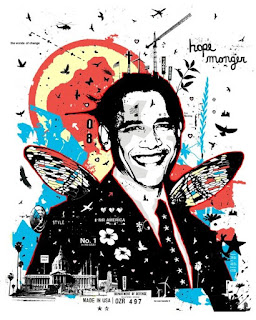
haemmerlein's pieces are physically and visually multilayered as well. each piece is carefully built up, either with layers of paper and media in his more painterly pieces, and with layers upon layers of text and imagery in his graphic design pieces. take for example the obama piece below. not only is the imagery rich and florid in its depth, but the words themselves "hope monger" are open ended. "monger" is a word that is most often understood as pejorative. in the complicated political climate of today's america, images such as this successfully speak to hope and jubilation while carefully reminding us of the importance of inquisitiveness and a constant questioning of the status quo.

No comments:
Post a Comment