patient readers,
i have not fallen off the face of the planet. in fact, contrary to what this blog may imply, i've been writing more than i have in quite some time.
i have refocused my energy on writing for a site called curbs & stoops, headed up by my lovely friend jeffrey, a grad student at risd.
though i may occasionally post here on party, i now have a full time job as well as a number of other responsibilities, so creating content for more than one site would be an awfully full plate. please visit curbs & stoops to read about contemporary art happenings all around the united states. it's like party like an art star... but with less typos....
Friday, May 21, 2010

Saturday, January 16, 2010
Jon MacNair Interview
 Jon MacNair, Mobile Home, ink on paper
Jon MacNair is an illustator living in Michigan. Originally born in South Korea, Jon grew up in South East Michigan. He received a BFA in illustration from the Maryland Institute College of Art.
Party Like an Art Star: You attended the Maryland Institute College of Art in Baltimore, but recently moved back to Michigan where you grew up. How are you liking being back in Michigan? How does it compare to Baltimore in terms of environment, art scene, and sources of inspiration?
Jon MacNair: It's been a big change. I lived in Baltimore for 8 years and being back in Michigan again is kind of odd. People asked me "Why are you going there? The job market is terrible." Really, I am back here because of my family and to be in a place where I have a support system while I figure out where to go next. I'm very much in what you'd call a "transitional period." I live in a very suburban area at the moment and there is not much to do around here. I feel myself craving the activity of a larger, livelier city. The art scene is pretty non-existent, so I haven't really been to any art events lately. I can't say that I've been all that influenced or inspired by my current surroundings. However, if you take into consideration the type of mood your environment puts you in, I guess on a subconscious level it's playing some part in my work.
Party Like an Art Star: Your work is highly detailed. Tell me a bit about your process. Do you do a lot of preliminary sketches, or do you just go for it? Your compositions are often very complex, and fill the page with such grace and precision, is every inch preplanned?
 Jon MacNair, Evicted process shot, ink and graphite on paper
Jon MacNair: I don't do a ton of preliminary work. I jot down words, phrases, and thumbnail sketches in notebooks. Usually it's just one rough thumbnail that only I can decipher, or sometimes no sketch at all. When I'm ready to begin the final, I'll rough it out in pencil on the paper (to get it right compositionally), then go back in and refine that sketch. Then I ink it or paint it. I wouldn't say every inch is preplanned. I find that a lot of the time I will take things out of the compositional at a later point because I realize they are unnecessary or there's just too much going on.
Party Like an Art Star: Most of your work that I've seen in person and on the internet, other than your graphic design work, is black and white. What is it that draws you to such a minimal palette? Do you ever work in color when doing personal work?

Jon MacNair, Collection Day, ink on paper
Jon MacNair: Yes, I'm trying to introduce more color to my work. I recently did three works for a show overseas that had some color in them (watercolor and gouache). In the past I've used color quite a bit, but with the development of this particular style and body of work, it's been more gradual. I'm still trying to find the right materials and palette to fit this style. I started with black and white initially because I was using black ink as my main medium and wanted to get comfortable with that material.
Party Like an Art Star: I read some where that you are working on painting more. Are your paintings much different from you illustration style? Is the content similar?

Jon MacNair, Amber Moon, mixed media, 5"x8"
Jon MacNair: My paintings (so far mostly on paper) are pretty much the same stylistically as my drawings. The content is the same as well.
Party Like an Art Star: Your images are have a haunting narrative quality, almost like illustrations for uber-warped fairytales. Where does your inspiration come from?
Jon MacNair: It's a big range. Everything from German expressionist films to plants that I come across walking in the park. I'm really into Russian animation these days and love the work of Jan Svankmajer. I also find a lot in inspiration in medieval and renaissance art, particularly tapestries and illuminated manuscripts. There's a certain flatness and awkward perspective in these that I enjoy.
 Jon MacNair, Man With Intricate Headdress, india ink, colored in and collage on paper, 9"x6.75"
Party Like an Art Star: Having mentioned that your work has a sort of fairytale, folkloric vibe, are you a big reader? What are your favorite kinds of stories?
 Jon MacNair, Man With Spear, graphite on found paper, 4.5"x8"
Jon MacNair: I love to read, but these days I don't have a whole lot of time to. I listen to a lot of audio books though, which allow me to draw and "read" at the same time. One of my favorite writers is Shirley Jackson. She has a whole range of work, from humorous to terrifying, with a lot of subtle psychological stuff going on in her stories. I enjoy endings that are kind of ambiguous too, which she certainly implements in her work.
Parrt Like an Art Star: You obviously possess a fantastic imagination, what are your most beloved ways to exercise it other than visual art?
Jon MacNair: Well, I remember using my imagination a lot as a kid when playing in the backyard or the woods. There was a lot of living room fort building and stuff being made out of cardboard boxes going on back then. I guess now instead of that I use my imagination to draw.
Party Like an Art Star: If you could be any fictional character for a day, who would you be?
 Jon MacNair, Under Skin detail, ink on paper
Jon MacNair: Well, if gender doesn't matter, I'd be Alice from Alice's Adventures in Wonderland. That just seems like one crazy ride of a dream. I've read the book many, many times and listened to the audio book numerous times too.
Party Like an Art Star: You are an impressively prolific artist, especially considering the highly detailed nature of your work. Do you have a good work ethic when it comes to concentrating on your art? What do you do to get over the hump when you have a day where you're feeling less than inspired?
Party Like an Art Star: You are an impressively prolific artist, especially considering the highly detailed nature of your work. Do you have a good work ethic when it comes to concentrating on your art? What do you do to get over the hump when you have a day where you're feeling less than inspired?
Jon MacNair: I think I've acquired a good work ethic. I make my deadlines and have learned to manage my time efficiently over the years. I have a lot of written lists that help keep me on track with what's next. If I'm working on something and it's going well, it's easy to stay motivated. It's when things are not going well that you really need to buckle down and tell yourself to stick with it. Most of the time it works out in the end. This is probably not the most interesting answer, but the pressure of deadlines often gets me over my creative hump. If it's not a matter of deadlines, drawing in my sketchbook sometimes helps.

Jon MacNair, The Pool, india ink on paper, 18"x24"
Party Like an Art Star: Finally, since we've now collaborated on two shows here on the West Coast, and you've had other works in shows here in Portland and elsewhere in the area, when will you be gracing us Left Coasters with your presence?
Jon MacNair: It will happen eventually. I'd love to come to Portland and check out the city. Perhaps when I get a solo show out there on the coast I'll make an appearance. Hopefully before then though!
Update: Recently, Jon made the trip to Portland, OR to attend the opening of the Portland Print show at Gallery 1910 (Greg at Hungry Eyeball has some great shots of the show as well as a ton of other amazing 2010 PDX openings on his Flickr), where he met a number of artists who joined me and Jon and I's friend Ellen in our quest to convince him to move out West (you can see pictures of the opening at Jon's blog Scritchy Scraps). It sounds like Jon had a lovely trip, including a visit to the Zoo, the Oregon coast, and several great art openings. We also had a chance to try Pho out on 82nd, which was delicious but very tricky to eat. Here's hoping that if myself and Jon's other admirers weren't able to convince him to move out here, the beef noodle soup did.
You can see Jon's work in a constantly growing number of shows, galleries and publications too long to list here. Visit his website, his lovely blog, or his Society6 page to get up to date information on what he's doing, where to see his work, or to buy prints!
Monday, January 11, 2010
Ashley Sloan: Like a Unicorn Pricess with a Mane of Twinkles and Cupcakes... Only Cuter
 Ashley Sloan, Untitled, graphite on paper, 20"x26"
Ashley Sloan was born in Albany, OR. She received her BFA at the University of Oregon, and now lives and works in PDX. In her short time here, Ashley has been wasting no time getting her art into some of the hottest galleries in the city, and getting her hands dirty with a wide variety of creative projects in the area. It doesn't hurt that she's cute as a button and exceptionally charming to boot.
When she's not working in her studio, Ashley helps out at OPENWIDEpdx, as well as contributing art to the Home School Art Shop, a fantastic project organized by the lovely Jacqueline and Jess.
Party Like an Art Star: You were born in Albany, OR. Have you always wanted to be an artist? When you were young were you a creative child? What did you drawn inspiration from in central Oregon?
Ashley Sloan: I always knew that I was good at and loved to make art, but I can’t say I always knew I wanted to be an artist. That didn’t come until I was a bit older, maybe even until I was 18 or so. But I definitely have always been creative and have always loved making art. In third grade my mom got me a watercolor set and it really took off from there. I would also do art projects for any school project, regardless of topic. In 5th grade I did a science report on fire ants and my mom and I sculpted a bunch of huge ants as my presentation. Another time I sculpted the head of Gandhi for a history project. I was always creating opportunities for myself to make art.
Interestingly enough, I didn’t think growing up in Albany was relevant to my work. But the more I think about it, it is a huge part of my inspiration. As an adult I look back on it as a small, boring town, but it was surprisingly inspiring as a child. It was safe enough for my parents to let me run around without supervision at anytime of the day. I lived next to a forest where I had tree forts and would sleep outside during the summer. It was a big surprise for me to move to a city where I didn’t know everyone and had to actually lock my doors. I had what would be considered the perfect, quintessential American childhood. Coming from that background of security and happiness is what creates my strong sense of nostalgia today and what made such a forced transition in my adult life.
Party Like an Art Star: You got an art degree from the University of Oregon. How did your experience at U of O influence your work? Any particularly inspiring faculty members?
Ashley Sloan: Honestly, I’m not yet sure how going to the University of Oregon influenced my work. I have a degree in digital art, but now that I’m out of school I barely touch my computer for artistic purposes. So I’m not sure what that means. I think what influenced me most about school was the people I went to school with and the faculty members I worked with. A lot of people in my program are amazing artists who have now turned into collaborators, co-workers and good friends.
As far as professors go, I can easily say Michael Salter had the most impact on the shaping of my experience. He’s an amazingly inspiring and encouraging professor who had complete confidence in me. I think that’s what I needed most in school, added confidence. He was the first person to tell me that what I was doing was totally valid and that I should pursue it. Honest critiques were also something he invaluably added to my education. I feel like a lot of art classes I took were almost too positive, to a fault even. He was the first person to challenge me and to give me constructive, honest criticism.
Party Like an Art Star: I read through your C.V. and found a show called The Cute Institute at Perfect Attendance in Eugene, OR. I lived in Eugene and went to U of O and I'm not familiar with the venue Perfect Attendance. I saw the installation photos, they are so cool! Can you tell me about this project, I'm fascinated!
 Ashley Sloan, Cute Institute installation detail
Ashley Sloan: Perfect Attendance was actually a group show of all the final thesis projects from my graduating class. We rented an empty storefront in downtown Eugene and pretty much got to do whatever we wanted with the space. My thesis project was The Cute Institute where I created an imaginary world where I attempted to scientifically examine cute creatures/objects. I think a lot of this project was also about reconciling what role femininity played in my life at that time. Finally being okay with making work that was unapologetically feminine. That body of work is really what has led me to the place I am today in my artwork.
Party Like an Art Star: Since graduating and moving to Portland you've shown at some of PDX's hippest galleries. How did you go about getting your work out there?
 Ashley Sloan, Untitled, graphite on paper, 22"x30"
Ashley Sloan: Well now I’m flattered. The simplest answer I can come up with is that I know a lot of people in the Portland art scene. And it’s an easy transition from being friends with artists to working professionally with them. Over a year ago I started contributing to the website http://www.openwidepdx.com/, and through that I’ve met many of the galleries and curators I’ve shown with. And honestly, many of the galleries I’ve worked with are owned by people I went to college with, such as Tractor Gallery, Chump Change Gallery and Lump West. So I guess as cliché as it is, for me it’s all been about who I know socially and professionally.
Party Like an Art Star: Many of the illustrations that you've done in 2009 deal with incomplete figures. Can you tell me about what this series means to you?
Ashley Sloan: Most of the time with my art, I don’t really know what I’m working through until I have about a year’s space to look back. As strange as it sounds, I often look at past work and with hindsight can understand what it was really about, not necessarily what I thought it was about at the time. I recently read Anne of Green Gables and think this sums up a lot of what this series means to me. “That’s the worst of growing up, and I’m beginning to realize it. The things you wanted so much when you were a child don’t seem half so wonderful to you when you get them.”
Party Like an Art Star: You work a lot in graphite. What is it about the media that draws you to it? Do you have other favorite media?
Ashley Sloan: I’m not sure what it is about graphite that I’m so drawn to, but it’s certainly my favorite medium. Sumi ink, colored pencils, acrylic paint and watercolors are also some of my favorites. It just depends on what kind of project I’m working on. I think another part of the story is that I was embarrassed for a long time in school to do graphite drawings. At the time I thought drawing was dead and that I should be using new and different techniques more suitable for the 21st century. But now that I’m out of school and left to my own devices I’ve reclaimed this medium for myself. Graphite drawings were almost a secret indulgence, but I feel most comfortable with a pencil in my hand and there’s nothing wrong with that. It was certainly a shock to most of my peers when my “Wish” show came out. Almost all of them thought that the series came out of nowhere, but really I’d just been hiding that part of my work for 4 years.
Party Like an Art Star: Portland is awash in artistic talent. Who are some of your favorite local artists, and where do you like to go to see art?
Ashley Sloan: Agreed. There are so many amazing artists working in Portland right now and it’s really almost impossible to choose my favorites. Some people that come to mind presently are MK Guth, Storm Tharp, Joe Thurston, Holly Andres, Damien Gilley and Mia Nolting. As for favorite galleries I’d have to say Appendix, PDX Contemporary, Tractor, Half Dozen, Fontanelle, New American Art Union, galleryHOMELAND, Rocksbox and Fourteen30. I would also like to mention two galleries that aren’t in Portland but are, in my opinion, some of the best galleries in the Northwest. Seattle’s Western Bridge and Eugene’s Ditch Projects are really amazing spaces I try to visit a couple times a year.
Party Like an Art Star: Ugh, yes Ditch Projects! I'm from Eugene, and worked in a gallery there for three years. Ditch Projects was the space I always wanted to create and that I always believed the Eugene/Springfield community deserved. Kudos to Ditch Projects!! (Really click their link!) Your artists statement explains that your art "portrays the moment when one involuntarily shakes off the shroud of stability and carelessness, to a reveal an adult life of hope, disappointment, and realistic worldview." We're less than a month apart in age. I felt like your statement pretty eloquently summed up the feeling of being in your mid-20s. How do you harness the tremendous energy of change and evolution that characterizes this phase of our life into mature artistic output?
Ashley Sloan: I think I ended up where I’m at right now unwittingly. Coming from post-college emptiness, I unintentionally tapped into this huge source of inspiration. No one told me what it was like after college and that almost everyone faces a sort of abyss where childhood and adulthood clash in your mid 20’s. But through my work I’ve started to identify these emotions in myself as well as in others. I try to make work that other people can relate to while also telling my own story. And I think with that in mind is where the mature artistic output comes from for me.
Party Like an Art Star: Do you feel like your recent artistic experiences have allowed you to grow out of the dogpaddle-sh feeling of the mid20s or wallow in it?
Ashley Sloan: I think identifying the problem is half the battle, so for me making this work is definitely a growing process. Identifying where I’m coming from, embracing that feeling, but also seeing what’s wrong with it has been a huge part of my life and art. And that’s where I try to instill my work with a certain amount of hopefulness. It’s okay to be nostalgic for the past but you have to be an adult at some point and that hard transition also hopefully includes a certain amount of optimism.

Ashley Sloan, The Best Night of Your Life, graphite on paper, 3.5'x7'
Party Like an Art Star: Much of your recent work focuses on the sort of accoutrements of femininity - dresses, ponytails... Are you a girly girl? Or is the isolation of these elements within the compositions a sort of rejection of their importance?
Ashley Sloan: Not surprisingly, you’d be hard-pressed to find a girlier girl than myself. In return, my work fully embraces all things girly. I love frilly dresses, bows, heels, and tulle, but that certainly wasn’t always the case. For years I rejected all traditional femininity. To me , being a feminist meant that I had to reject everything associated with girliness. But the last year of college I worked at the university’s Women Center and realized that embracing being a woman didn’t have to mean giving up girly things. I think that the work I’ve created since that time has been a personal evolution of accepting the validity of femininity. So as much as my work is about becoming an adult and putting away childish parts of myself, I simultaneously embrace aesthetics associated with young girls.
Party Like an Art Star: Wow, I can certainly identify with that. Growing up in a hyper liberal community I always felt that the most acceptable form of femininity was a sort of starched, hard-nosed state with no bells and whistles. It took me years to understand that my strength was in my actions not the stoicism of my dress. I was so happy to move to Portland where I could go out in heels and a pencil skirt without being asked if I was on my way to a funeral.
What are your artistic goals for the coming years?
Ashley Sloan: I think to just keep making art is my main goal for the future. New year’s Resolution: I want to make art my main priority. It’s easy for me to get distracted with everyday busyness; it takes a concerted effort for me to make a new body of work. But I recently got an art studio, and think that will contribute to me making art on a more regular basis. Other than that, I’d love to expand beyond Portland and have more shows around the country. I’m also thinking about getting an MFA in the next five years.
Party Like an Art Star: I really love your sculptural and installation work. Do you tend to work in 2D and 3D simultaneously or do you work in phases?
Ashley Sloan: I’m not sure if I have a regular way of working between 2D and 3D. With The Cute Institute, I made the stuffed animals before anything else and then created the paintings and installation. But even those started out as a sketch, so I think I almost always start with a sketch whether it’s for a 2D piece or 3D piece and go from there. I haven’t been doing a lot of 3D pieces lately, but am starting to work on some large-scale sculptures as part of an installation I’m creating.
Party Like an Art Star: Portland has a huge number of creative types trying to make a go at being a professional working artist. You seem to have done very well for yourself in the Portland scene in a short amount of time. Do you have any advice for artists just arriving in Portland?What is your best advice for how to stand out in the very large crowd of PDX artists?
Ashley Sloan: I think just getting involved in the art scene is the most important first step to standing out. When I first arrived I made a list of galleries and people whose interests somehow intersected mine and contacted them. Despite the fact that there are tons of artists in Portland there’s also a huge amount of venues and opportunities available to emerging artists. That’s what I love about the Portland art scene, it’s pretty easy to immediately become involved. I also think having an art website is huge. Without a website it’s a lot harder for people to become interested in your work.
Party Like an Art Star: If you were a crayon what color would you be?
Ashley Sloan: Hmm…not sure about crayon color; maybe the Cotton Candy crayon from Crayola. It’s a good light-colored, airy pink. Perfectly summing up my feminine indulgences.
 Ashley Sloan, The Best Night of Your Life detail, graphite on paper, 3.5'x7'
Party Like an Art Star: Favorite way to reward yourself when you complete a new piece?
Ashley Sloan: Unfortunately for my health, I definitely reward myself with sweet things. I have a ridiculous sweet tooth (as can be seen in some of my past art) and can pretty much be convinced to do anything if I get a dessert as reward.
Play for Keeps Opening a Complete Success!
 we were told again and again that january was a hard month for first thursday in portland. the weather is too cold for most to brave, and many are financially tapped out after the holidays. elizabeth and i approached the opening last week with excitement mixed with trepidation. despite my uncertainty i chose to go into it without expectations, because in my experience expectations often lead to disappointment.
in the final hours of the day, approaching 6'o'clock when we would throw open the doors, i felt nervous. the show looked amazing, it filled the space well, and all our ducks were in order, yet i couldn't help but feel a bit anxious simply because it mattered to me so much. i'm a social person, but i get nervous in large crowds of people and openings have been notoriously hard for me. i'm not sure where it came from, but in the final minutes before we opening i managed to stumble on a rather significant well of confidence, and when people started streaming in i felt like a million bucks.

 luckily, this feeling of elation was not only engendered by how amazing i felt in my little black dress. from the very beginning the public's reception to the show was amazing, and the room filled quickly! for almost four hours the tribute gallery was packed wall to wall. though i did spend a good chunk of time pouring beer (generously donated by our friends at ninkasi brewing) and leveling pieces that were gently jostled by the lively crowd, i managed to have a number of wonderful conversations with people about art, curation and the tribute gallery.
we sold six originals the first night, which is great for a january first thursday! and more importantly an impressive number of portland's art lovers got the chance to see play for keeps in all its opening night glory. tribute gallery was the most hopping spot on the block without a question. while other galleries hosted beautiful openings with plenty of breathing room, the play for keeps opening could only be described as HOT. the body heat alone was enough to send me running (more like slowly making my way) out the door into the cold january night every few laps. elizabeth and i got some of the greatest compliments. one man told me that it was the best group art show that he had been to since living in portland, and someone said to elizabeth that they saw more pieces in the show that they would hang in their bedroom than any other show they'd seen (bedroom art is personal! that's a big compliment!)

all of the pictures that i've posted here were taken by jon macnair's friend ellen, who was a delight to talk to, and took some amazing pictures! i will hopefully have more to post soon. you can see more at jon macnair's blog scritchy scraps.
Tuesday, December 29, 2009
cope2 online gallery at curbs and stoops!

my good friend jeffrey over at curbs and stoops just put up an online gallery of exclusive new works from world famous cope2! we also collaborated on an interview with the legend that should be up soon. i'll keep ya'll posted.
Cope2 grew up in the public housing projects in the late 1970s. He
came to graffiti like everyone else in those days, at an age when
young men and women began to explore the urban labyrinth where we all
lived. Active in the graffiti scene since 1978, Cope2 has grown to
become an ambassador for New York graffiti. Cope2 has a roster of
accomplishment including commissions by Time Life Magazine, an
apperance in Marc Ecko’s 2006 video game, Getting Up: Contents Under
Pressure and a documentary on his life. Despite his success, Cope2
remains the same rugged graffiti artist he was in the 1980s.
You can find the interactive gallery show at :
http://www.curbsandstoops.com/blog/?page_id=64
Any help in spreading the word would be appreciated.
About Curbs and Stoops:
Curbs and Stoops is a non profit organization that is working towards
increasing the accessibility of art across a diverse range of
socioeconomic and cultural communities. Like our name suggests, we
promote art at the thresholds that define our cities, our curbs and
our stoops. This way, art is not a destination, like going to a
museum. Instead, it is a part of our journey. We fulfill our mission
by implementing public art projects, community installations and
street art. We attempt to exploit the extents of interactive media in
order to provide fine art to those who cannot afford gallery prices.
We believe in the necessity for the accessibility of art. Art is no
longer for bankers and heiresses.
Cope2 grew up in the public housing projects in the late 1970s. He
came to graffiti like everyone else in those days, at an age when
young men and women began to explore the urban labyrinth where we all
lived. Active in the graffiti scene since 1978, Cope2 has grown to
become an ambassador for New York graffiti. Cope2 has a roster of
accomplishment including commissions by Time Life Magazine, an
apperance in Marc Ecko’s 2006 video game, Getting Up: Contents Under
Pressure and a documentary on his life. Despite his success, Cope2
remains the same rugged graffiti artist he was in the 1980s.
You can find the interactive gallery show at :
http://www.curbsandstoops.com/blog/?page_id=64
Any help in spreading the word would be appreciated.
About Curbs and Stoops:
Curbs and Stoops is a non profit organization that is working towards
increasing the accessibility of art across a diverse range of
socioeconomic and cultural communities. Like our name suggests, we
promote art at the thresholds that define our cities, our curbs and
our stoops. This way, art is not a destination, like going to a
museum. Instead, it is a part of our journey. We fulfill our mission
by implementing public art projects, community installations and
street art. We attempt to exploit the extents of interactive media in
order to provide fine art to those who cannot afford gallery prices.
We believe in the necessity for the accessibility of art. Art is no
longer for bankers and heiresses.
Tuesday, December 22, 2009
team work makes the dream work!

(image: brooklyn yards, se portland)
the good news continues!!!!
art stars, i appologize about the delay in blogging!
worked my tail off and saved enough to replace my long ago stolen laptop. i was unable to replace the macbook due to lack of fundage, so i took a gamble on an hp... i will not be jetting off to vegas any time soon, as my risk assesment skills seem to be askew... the hp's mother board crashed within two weeks of me owning it, so i was subject to yet another sad bout of off-lineness. however, after some seriously nerve frying trouble shooting and a three week computer hospital stay, my new computer seems to be on the mend and ready to work!
i spent my first couple of months in portland heavily ensconced in a world of constant work, in a perpetual state of confusion about where i was. i love portland very much, but in terms of infrastructure it is more than a little confusing at first. as i mentioned, i got a job bartending at a spot on north mississippi. loved it during the summer, but like any restaurant job the charms quickly wore thin (not in small part because customers who caught wind of the fact that i once worked at an art gallery never tired of reminding me of what a "step down" my job was). my position at casa ended a couple weeks ago (many high end restaurants in portland are on dangerously uneven footing due to the economy, as well as clever pdxers' food cart revolution - more on that later), which would have been PANIC inducing had i not had a very special project, very close to my heart to work on. this coming month will mark the opening of my first curatorial endeavor here in pdx!
 jon macnair, hide and seek, ink on paper, 11"x14"
the image to the left is by baltimore artist jon macnair. it was created as a submission for Play for Keeps a group show of new works on paper at The Tribute Gallery in old town china town, pdx. (we used this image for our promotional material. i will post images of our flier, created by the lovely yamille at cloudstop design, as soon as i have the appropriate file type!) my good and brilliant friend elizabeth lamb worked with tribute's wonderful owner brian t. wilson previously, and when they decided that elizabeth would guest curate a show at the gallery she brought me on board.
we made our call to artists in november, and put it out in the universe not knowing what to expect. elizabeth is a brilliant arts adminastrator who works as coordinator at white box gallery, and who i've known for many years as a close personal friend and beloved dance partner. i was extremely flattered that she chose to involve me in her project, and very pleased to discover that we make quite a dynamic team. we mulled over many thematic ideas for the show. working with brian to hone our vision and clarify our thought process when it came to what kind of art we wanted to exhibit was a really interesting experience. i had never been on that side of the fence, and i enjoyed the flexibility and humility it required of me. i am very excited for brian to see the final result. i think that he's going to love the show, and so will our friends, audience and participating artists!

joshua witten, running with scissors, graphite and ink on paper, 8.5"x11.5"
we were very lucky to recieve a high volume of exceptional submissions. i was astounded at the outpouring of talent. we got a bunch of really cool submissions from local portland artists, but also artists from all around the nation. we have participating artists from nyc, florida, dever, los angeles, indiana... the list goes on and on! i'm honored to mention that jon macnair, patrick haemmerlein, and joshua witten, who all participated in my menace to propriety show, will be exhibiting with us. i also have art coming from a dear friend (and coordinator of the awesome international mail art program that i tend to hinder with my lateness) in florida, breanne rupp, who will be shipping off her pieces before a cross country move to the bay, and four wickedly inventive paintings by an old college buddy and portland resident (a talented artist and entrepeneur - check out his hard work at hasbeen design) huy nguyen, whose work i have been wanted to exhibit for a very long time. though it was fun to draw talent from all over the nation, it was extremely rewarding for me to get a glimpse of the depth of talent in my new home town, like the beautiful and gifted ashley sloan, whose charming graphite drawings will certainly be a highlight.
Tuesday, July 21, 2009
great news!!!
art stars!!!!
i am so excited to finally be getting settled into my new city. it was a big transition, with many unexpected twists and turns, but i am finally starting to feel at home in portland, and let me just say it feels good.
i've made it to a few art openings in the past few weeks, but my internet access is currently limited to my wonderful roommate's dinosaur of a laptop with pirated internet that hadn't been working in a while. so while i've been getting to know the scene i've been taking mental notes for when i finally get cooled down enough to get focused.

steel bridge at night, pdx
the art that i have seen so far has been amazing. portland is a crazy city in that almost everywhere that you go is some form of art venue. coffee shops, restaurants, boutiques. everyone has got art. sure this mass proliferation means that not every artist's work that you see is going to blow your socks off, but it is exciting to see so much creativity in such a small area, and additionally to see so much support for the arts from the city itself!

art lovin' portland mayor sam adams
our mayor sam adams has instituted some amazing support systems for the arts in portland in his brief, scandal ridden career as portland's mayor. say what you will, but the man is on my team. i got a job bartending at a great place on mississippi avenue. last week we catered the opening of the q center down the block, which is the new lbqta center for north portland. sam adams was hosting and though i restrained myself, i really wanted to just give him a big 'ol uncomfortable waist hug for showing the arts so much love.

everett lofts, pdx
last first thursday i had a great time visiting studios near everett. i am planning on revisiting two of the shows to take notes for pieces that i'll write later this week. portland's first thursday is a zoo. its a very see and be seen kind of atmosphere, but what makes me very happy to see is that most of the attendees are actually talking about the art, taking the time to digest and discuss, rather than simply hover around the free booze.
i am so excited to finally be getting settled into my new city. it was a big transition, with many unexpected twists and turns, but i am finally starting to feel at home in portland, and let me just say it feels good.
i've made it to a few art openings in the past few weeks, but my internet access is currently limited to my wonderful roommate's dinosaur of a laptop with pirated internet that hadn't been working in a while. so while i've been getting to know the scene i've been taking mental notes for when i finally get cooled down enough to get focused.
steel bridge at night, pdx
the art that i have seen so far has been amazing. portland is a crazy city in that almost everywhere that you go is some form of art venue. coffee shops, restaurants, boutiques. everyone has got art. sure this mass proliferation means that not every artist's work that you see is going to blow your socks off, but it is exciting to see so much creativity in such a small area, and additionally to see so much support for the arts from the city itself!
art lovin' portland mayor sam adams
our mayor sam adams has instituted some amazing support systems for the arts in portland in his brief, scandal ridden career as portland's mayor. say what you will, but the man is on my team. i got a job bartending at a great place on mississippi avenue. last week we catered the opening of the q center down the block, which is the new lbqta center for north portland. sam adams was hosting and though i restrained myself, i really wanted to just give him a big 'ol uncomfortable waist hug for showing the arts so much love.
everett lofts, pdx
last first thursday i had a great time visiting studios near everett. i am planning on revisiting two of the shows to take notes for pieces that i'll write later this week. portland's first thursday is a zoo. its a very see and be seen kind of atmosphere, but what makes me very happy to see is that most of the attendees are actually talking about the art, taking the time to digest and discuss, rather than simply hover around the free booze.
Wednesday, May 27, 2009
when life gives you lemons... throw them at a passing car...

i sincerely apologize for the blatant lack of posts over the past couple weeks. as is true with anyone's life, mine has been a series of peaks and valleys over the past few years. the month of may has brought me nothing but trouble this year. stopping short of spewing a diatribe about all the miserable luck that has befallen me, i will rehash only the detail that seems most prevalent to this blog. last weekend i got robbed, and my lap top was stolen.
upon waking and seeing the destruction and chaos that was my apartment i immediately called the police to report the kidnapping... for the record the police do not consider the loss of a laptop to be a kidnapping, as they do not consider the bond between computer and blogger to be that of mother and child - despite my best efforts to explain the unimaginable loss that i felt.
i've been trying to put the pieces of my life back together after the incident (they also stole my purse so i had the arduous task of re-obtaining all of my i.d. and such). i believe strongly that when things like this happen you have to do your best to find the silver lining. yes, my stuff got stolen and my privacy was violated, but on the other hand the universe gave me a grand opportunity to simplify my life.
instead of replacing the fancy iphone that i had, that to be perfectly honest intimidated me from the get go, i went to a local electronics recycling place and got an old refurbished phone. instead of spending my money drowning my sorrows in expensive vodka presses at the local watering hole, i've been not drinking and running in the free sunshine. instead of blogging from my macbook pro in my lovely little apartment i've been slaving over an old desk top at my 'rents' house. it may not be glamorous, but i've been enjoying reconnecting to the simpler pleasures in life, and by taking an ardently positive approach i've succeeded in reminding myself daily that the thing that i lost are just that... things.
on top of the copious amounts of theft that i've been dealing with it is a transitionary time for me at the gallery. i'll be leaving fenario at the end of june, and though i don't know what my next step will be, i know that i'm ready for it. i've lived in eugene all my life, and though i live fenario and the challenges it provides, the city itself and the art scene here is not as challenging as i'd like it to be. as i've explained to friends, living in the city where i grew up, with the built in safety net of a town that you know intimately, i often feel like i'm sitting in a wheel chair despite the fact that my legs work fine.
i'm hungry for the next big thing.
if there's serious gaps in posting, please know that i'm simply spending my time trying to get to the next step, and whatever that is will only serve to broaden my interest in and passion for art. i'll do some posting this week to try to get back on the pony, and from there we'll see where it goes.
Monday, May 4, 2009
joshua witten: allegorical alchemist

joshua witten, the tea party (detail), ink, oil and pencil on canvas, 30"x24"
CG: tell me a little about where you live and work.
I live in the great state of Indiana and am currently a framing manager at Michaels, the arts and crafts store.
CG: what kind of media do you prefer?
I can’t really say that I prefer one media over another. I suppose if I had to pick one it would be graphite as it was my first love. There is something about the simplicity of pencil and paper that is very appealing to me however I love painting, printmaking and sculpture as well.
joshua witten is an artist and illustrator living in the great state of indiana. he is a participant in this months' "menace to propriety" show and agreed to answer some of my questions about his art. witten's images were a hit at friday's opening, and his "the magic show" painting was used for the promotional material for the show. his clean, eloquent illustration style is what caught my eye first, but his clever themes and concepts are what made me a super fan.
I live in the great state of Indiana and am currently a framing manager at Michaels, the arts and crafts store.
CG: what kind of media do you prefer?
I can’t really say that I prefer one media over another. I suppose if I had to pick one it would be graphite as it was my first love. There is something about the simplicity of pencil and paper that is very appealing to me however I love painting, printmaking and sculpture as well.
CG: you have a really unique technique when it comes to painting. the two canvases that you sent me for the "menace to propriety" show both include oil paint as well as ink, which it appears is used to define the more graphic elements of the composition. how did you come to this style?
How did I come to this style? That is a very good question. I think it began with hieroglyphs. Seemingly all cultures used a hieroglyphic method at some point in their artistic history regardless of who they were or where they were. To me hieroglyphs are like a universal human language that transmits information across time and space. With this in mind I had been making various drawings and prints that combined these ancient elements with ideas of modernism and postmodernism in order to create something new that was also rooted in the past. The two canvases that I sent to you for the “Menace to Propriety“ show are part of a larger series of ten entitled, “Occam’s Razor and Other Short Stories.” The series was an opportunity to take everything that I had done on paper and apply it to canvas with the idea of making paintings that looked like my drawings and prints. I tried a lot of different techniques before finally settling on ink, oil and pencil. The final result was an amalgamation of media, like a hybrid of graphic minimalism with heavy emphasis on black. I suppose in the end I would say that I came to this style through constraint. Charles Eames once said that design depends largely on constraints and I think he was right on the money.
CG: what is your working process? can you tell us a little about how you go about transforming your ideas from thoughts to material objects?
I always have ideas floating around in my head. Some get written down, some don’t. Some come to the forefront while others stay back. Typically, I start thinking of certain ones more than others for varying reasons. Sometimes I don’t know the reasons until much later if I ever know them at all. In any case, those ideas that I think about most are usually the ones that I start doing research and preparatory sketches for. These become the foundation that I use to make the final artwork, be it a painting or a drawing or a print.
CG: what do you draw inspiration from?
Anything and everything.

joshua witten, the executive, ink, oil and pencil on canvas, 20"x16"
CG: fellow artists that you admire? alive? dead?
There are a lot of them so this could be a long list. Let’s start with the dead ones...they are in no particular order…Picasso, Warhol, Degas, Klimt, Frida and Diego, Hockney, Schiele, Balthus, Basquiat, Franz Kline, Pollock, Tamara de Lempicka, Mary Cassatt, Vincent Van Gogh, Gauguin, Michelangelo, Botticelli, Harunobu, Osamu Tezuka, and Rockwell. Now moving onto the living…also in no particular order…Audrey Kawasaki, Amy Sol, Sylvia Ji, Murakami, Walton Ford, Frank Miller, and Julian Schnabel.
CG: you have a fantastic piece called the antigravity machine that depicts a boombox and a break dancer. are you a dancer yourself? a music lover? what kind of tunes get you in a creative space?
I wouldn’t call myself a dancer per say but I can shake it if I need to because I truly am a lover of music. “The anti-gravity machine” represents my great fondness of the hip hop culture and aesthetic. At the time I was listening to a lot of Common and At The Drive-In and if you look closely enough you can see those influences in the work for sure.
CG: where have you shown your work? where will you be showing in the near future?
I have shown my work in a number of places. I have shown locally in Indiana at Artlink Contemporary Art Gallery and at The Spurious Fugitive Gallery which I am sorry to say closed its doors in March. I have also shown at Eclectix Gallery and Gallery Nucleus which are both in the great state of California. In the near future I will be showing at Artlink Gallery and the Fenario Gallery for your show, “Menace to Propriety.”
CG: how do you feel being asked to participate in the "menace to propriety" show? is your work intentionally provocative?
I feel honored to be asked to participate in this show. I really haven’t ever considered my work to be intentionally provocative until thinking about the literal meaning of the words, “menace to propriety.” I might say now that some are definitely more provocative than others because they contain a subtle message that sometimes asks viewers to question authority.
CG: occam's razor is the theory by which i live my life. simplify, simplify, simplify. you have a series calles "occam's razor and other short stories." can you tell me a bit about this series and about your relationship to the theorem of occam's razor?
As I said before, “Occam’s Razor and Other Short Stories” technically speaking was an opportunity to take everything that I had done on paper and apply it to canvas with the idea of making paintings that looked like my drawings and prints. At the time I was thinking about globalism, world trade, and the environment. So, thematically the series began to develop with these ideas in mind. “The Tea Party” for example is as much about China and the United States as it is about as it is about Alice and the March Hare…which leads me to the overall title of the series, “Occam’s Razor and other Short Stories.” Originally, I planned to have the entire cast in my interpretation of the tea party however constraint led me to cut out the Mad Hatter and Door Mouse and focus solely on the relationship between Alice and the March Hare. Following suit, I simplified the content and imagery in all of the other paintings in the series. As this simplification process continued, and technique and theme began to merge together, I remembered the idea of Occam’s Razor and felt it would be a good fit for the series.
CG: "the golden age" is a complex series that seems to be dealing with the commoditization of icons, and our societies lust for logos and branding. can you tell me more about this series? is it ongoing?
“The Golden Age” is an ongoing series that was originally going to be about mythology of various sorts and while it still kind of is, it has also become a commentary on the “commoditization of icons, and our societies lust for logos and branding” as you so eloquently put it. While attending art school there was a visit from the artist Robert Stackhouse. He told one of the students to paint something from this day and age like a Nike Swoosh and the idea of art and logos and branding has stuck with me. So, of course my golden apple of the hesperides is represented by an Apple Computer Logo.
“The Golden Age” is an ongoing series that was originally going to be about mythology of various sorts and while it still kind of is, it has also become a commentary on the “commoditization of icons, and our societies lust for logos and branding” as you so eloquently put it. While attending art school there was a visit from the artist Robert Stackhouse. He told one of the students to paint something from this day and age like a Nike Swoosh and the idea of art and logos and branding has stuck with me. So, of course my golden apple of the hesperides is represented by an Apple Computer Logo.
CG: what do you do when you get stuck on an image?
I start another one.
CG: how do you reward yourself when you finish a piece?
I don’t reward myself when I finish artwork, but it sounds like a good idea. Maybe I will buy the new Prince album when I finish with the next one.
CG: anyone ever get any of your images tattooed on them? seems like they'd make for great ink!
A couple of people have actually tattooed themselves with my art. I recently drew one for my good friend who is a union man in Indianapolis. It is a bit daunting to think of my art permanently etched onto another person, but when it is I can’t help but feel the love.
CG: favorite children's book growing up?
“The Little Engine That Could”

joshua witten, the magic show, ink, oil and pencil on canvas, 16"x20"
CG: favorite board game?
Trivial Pursuit
CG: if you had a super power what would it be?
Enlightenment
Monday, April 27, 2009
aaron johnson: mad scientist
aaron johnson, a nyc based painter of epic talent, is the kind of innovative artist that i hunt for in my oft-daily art safaris on "the internets" (term borrowed from henry rollins, who is a hilarious, volatile, though incredibly long winded speaker). not only is his visual style unique, but the process through which the artist creates his pieces is wholly original, and in many ways its complexity adds to the singularity of the compositions. johnson's themes range from carnival like characters to the circus of modern politics, and every shade of horror and chaos in between. and yet despite the carnal quality of johnson's work his playful palette and lyrical passages of filigree champion the beauty within the macabre.

aaron johnson, the gunslinger, 2007 acrylic and collage on plastic construction netting
I find that the chaos, frenzy, crowds, and action of the city provide the right balance to my studio, which is the opposite, a place of solitude, isolation, and singular focus on the one big thing: making art. The two extremes compliment each other.
CG: Do you attend many art shows in NY? Favorite galleries? Working artists who's work you really enjoy?
I get out to see art in galleries and museums and friends' studios at least once a week. It's important to know what's going on in order to engage in some kind of a common discourse. I'm a fan of too many working artists to name, but here's a few: Jim Lambie, Daniel Richter, Paul McCarthy, Barnaby Whitfield, Tom Sanford, Debra Hampton, Tracey Snelling, Benji Whalen, Kristen Schiele, Laura Schnitger, Peter Saul, Urs Fisher, Trenton Doyle Hancock, John Newsom, Allison Elizabeth Taylor, Judith Supine.....that's a few off the top of my head.

aaron johnson, the second coming of uncle sam, 94"x66" acrylic on polyester flag
CG: Your imagery is at once deliciously grotesque and delicately beautiful. How do you strike a balance? How did you come to this style of imagery?
For me my works are successful when I've reached something that's visceral to the point of making the viewer's skin crawl, visually charged to the point of making the viewer's retinas quiver, and layered in suggestions of narrative that make the viewer psychologically uncomfortable. My visual vocabulary draws from several sources: my degree in Molecular Cellular Biology; the influence of Indian art and culture which was all over my house growing up; and of course a long list of painters I admire from Otto Dix to Bronzino to Peter Saul.
CG: Where do you draw your inspiration from?
The motivation to always make my new works better than the previous ones is a big drive. Listening to talk radio about current events inspires me to make work that deals with our contemporary human condition. Listening to endless music keeps me going in those passages of details that can seem endless (today it's Beirut, Gang Gang Dance, Carbon/Silicon, and Sun Kil Moon).
CG: You have an amazingly complicated technique, that essentially requires you to think backwards to create the final image. Did this process come naturally to you or was it a struggle to train your brain to plan in such a way?
The process started by playing around with drips of paint that I would peel off the plastic covering on the floor (back in the days when my studio was in a corner of my tiny apartment). I'm always experimenting with ways to make a painting. Otherwise I get terribly bored and the works gets stale. The process evolves really naturally. I've been making paintings according to this weird reverse painted acrylic polymer peel process since about 2002, but that process is always in flux and always evolving. The constant has to be change.

aaron johnson, the sword swallower, 106"x97"acrylic and collage on construction debris netting
CG: You've received some seriously impressive accolades in the past few years from publications as lauded and influential as The New York Times and Art News. Any particular compliments/reviews that meant a great deal to you? Whose opinion do you cherish the most when it comes to your work?
Hmmmm.......well, my work is "difficult" for a lot of people, because it deals with ugly realities, brutality, violence, sexuality, and the dark aspects of The American Dream. Getting positive reviews from some real authoritative critics makes some people take my work more seriously. I really appreciate it when critics support work that is challenging and relevant. There's a nice recent article by Scott Indrisek in Whitewall magazine (you can read it online www.whitewallmag.com pages 64-65)
CG: I loved your studio visit on Fecal Face. Great space! Your space is full of work in various states. It would seem that your process is fairly involved. Do you work on one piece at a time, or jump from piece to piece?
I work on 2 or 3 at a time, and then when one particular piece really grabs me full-force, then I'll focus on just that one while the others wait. Some of them get started and then sit around for 6 months before I figure out where they're going.
CG: Here's a funny one for you: A lot of your sort of lacy details remind me of geodes, mineral formations and fossils. Have you ever been a rock collector? Do you draw inspiration from patterns in nature?
When I was a kid I had a "nature museum" in this walk-in closet in our house, which I filled with specimens I collected in the woods. I would display these things (hornets' nests, dead dragonflies, tree fungus, bones, etc) on shelves and I would document each object with a drawing. Years later, like I mentioned, I was a science major in college. In a way it's always been art and science hand in hand for me.
CG: How do you celebrate when you've successfully finished a piece that you're pleased with?
I stare at it for an hour and start the next one.
CG: With the use of the stretched plastic, I can't help but draw a comparison between some of your pieces and Duchamp's The Large Glass. They share that great quality of being at once traditionally two dimensional as well as containing a sort of deeper sculptural quality, inspiring in the viewer a strong desire to look deeper and see beyond the surface. Any past artists whose work inspires your process or who you like to reflect on?
I see a kinship between my process and the work of Sigmar Polke. He really considers painting as the chemical reaction that it truly is, and he doesn't take anything for granted; everything is chosen for a purpose in the physicality of his works (he has worked on transparent materials, too, and has done reverse paintings on glass).

sigmar polke, beyond the rainbow, 2007, 142cm x 124cm, mixed media on fabric
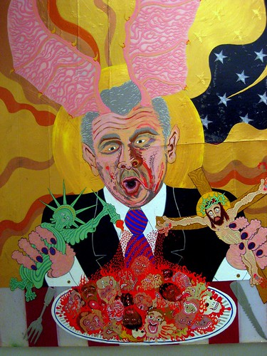
aaron johnson, commander's feast (in blood and fire), 2008, 53"x44" acrylic polymer and pigment on polyester flag,
CG: Best pizza in NY?
Grimaldi's in Brooklyn
*Agreed! My cousin (ironically also named Aaron) sent me there when I stayed with him in Williamsburg, best pizza I've ever had!
CG: Favorite Brooklyn landmark/hang out?
Landmark: the Navy Yard (where my studio is)
Hang out: Havana Outpost
CG: If you could instantly acquire a new skill this instant what would you want it to be?
To play guitar like Muddy Waters
CG: Clown or magician?
I hate clowns, and I have no interest in magicians. You could argue I'm a clown and a magician in my artwork, but maybe more a mad scientist, and a court jester.
CG: Night or day?
Yes.
CG: And finally, if you were going to make a grand entrance, what song would be playing to say "Aaron Johnson has arrived"?
I like to sneak into the room unnoticed.
aaron johnson has an upcoming group show at new image art in los angeles entitled "octo pusses" beginning may 2nd. check it out if you're in the area. new image art is an amazing gallery.
Sunday, April 26, 2009
this week i read...
yeah i'm one of those weirdos who still reads... books that is. quite voraciously actually. in some ways reading is my cheap replacement for continued schooling that i can't afford. i figure just because i can't afford to be a lifelong student doesn't mean i can't spend the rest of my life in the pursuit of knowledge.


but let's not get it twisted. i'm not out there every day devouring tolstoy and nitzche. i looooove steven king. adore him. and i love cheesy murder mysteries and lurid true crime novels. but i also take great pleasure in reading tomes that are challenging and give pause. this week has been a calm before the storm; a relatively slow week before i dive into the hang for next week's group show. one of those weeks where the phone just doesn't seem to ring and there are many empty, quiet hours to spare.
i spent those hours reading....
yes, i do on occasion judge a book by its cover. the quirky illustration by matthew green (jacket design by faber) caught my eye in a portland bookstore. also, can't escape the intrigue of the title. i have to hand it to nathan englander for this one. a charming surprise the ministry of special cases carries on the tradition of magical realism with a clever and at times laugh out loud story that takes place during argentina's dirty war. the story, that of the affable yet confounding kaddish poznan, a man's who's job it is to chip the names off of gravestones for families who would rather forget their controversial pasts, dances back and forth between passages of hilarity and mirth and scenes of great tension and terror. i found the book surprisingly heavy given the frequent humor. it had the sort of narcotic but arresting pace of gabriel garcia marquez, though i think that englander fell a bit short of the narrative power of marquez at his best.
krakauer at his finest. i was a bit wary of this one. i'm a notoriously unspiritual person, and though i see validity in trying to understand religion as an extraordinarily powerful social force, i have difficulty wrapping my mind around what i perceive as the extremity of blind faith. under the banner of heaven starts with a flash and doesn't let up until the final chapter. even the final passage was pitch perfect, and i think that the quote that krakauer chose to conclude his book with couldn't have been more apt. meticulously researched and powerfully written krakauer's book takes an in depth look at america's complex homegrown religion, framing the tragic tale of the murders of brenda and erica lafferty at the hands of two devout fundamentalist relatives with compelling chapters detailing the religion's history and significant leaders. rather than attack mormonism as the direct source of such a violent act, krakauer explains how mormonism's fundamental tenants open the religion up to periodic splintering and wide interpretation. some of the stories about the various fundamentalist groups that have cropped up over the years are extremely harrowing in their graphicness. mormon fundamentalist groups are rife with institutionalized racism, blatant and often violent sexism and condoned acts of statutory rape and even incest. krakauer, a great adventure writer, alleviates some of the tension with wonderful passages describing the natural environment in the mormon kingdom of utah, and finds heros in unlikely places to champion in stark contrast to the antagonists of the story. a quick read and highly informative. only draw back? i may be rethinking that hiking trip i was planning to zion.
i pull this book out every few months to peruse the brilliant essays on topics ranging from process to figuration. this morning i was re-reading a great interview with roy lichtenstein conducted by g.r. swenson in 1963. what a g.
Saturday, April 25, 2009
hungry lion
HAHA!
because i bet you didn't know i secretly moonlight as a grimey festie kid.

party like an art star's auteur at langerado '08 - south florida

filthy feet! trademark of all good music gatherings. whooooie those are some white legs!
max kaufmann

max kauffman, if this is any indication,
i am admittedly one of those horrible seaboard dwelling americans who has a veritable blank spot in my mental map when it comes to the midwest.
ohio? really?
missouri? no idea.
basically my working knowledge of midwestern states comes only from the music festivals they hold each summer.
michigan? rothbury!
minnesota? 10,000 lakes!
illinois? summer camp!
well fortunately looks like illinois has much more to brag about than summer camp '09. originally from chicago, illinois artist and illustrator max kauffman spent his idyllic youth in south bend, indiana rolling between the countryside and the city on four wheels and a deck. this fluid relationship between the urban and the bucolic can be seen reflected in the organic and simultaneously architecturally constructed compositions of this very talented and free spirited artist.

max kauffman, power exchange, 12"x12" mixed media on watercolor paper
kauffman left the midwest for arizona in 2000 and finished up an art degree at arizona state university in 2004, with a focus in ceramics. he also earned himself a minor in anthropology, which seems to have had a formative influence on the sort of folkloric, mythological imagery that pervades kauffman's work. much of the artist's oeuvre consists of imagery that alludes to the tenuous relationship between science and nature. though science is often a tool used to understand nature, in recent years science has often been applied in such a way as to move further and further from the natural order of the earth. more and more often we see science used as a tool to tame, corral and subjugate nature to suit our human needs, rather than a lens through which we can explore the best ways that we can live simply on the earth.
power exchange is a great example of this theme. the composition depicts a robot, easy read as either imposing in its forward thrust posture and agape mouth or somewhat sad in its blank eyed stare and imploring body language, offering a totemic bird figure a hand full of what appear to be batteries. however, the batteries could be alternately read as worms or grubs, being the power source for the bird. i love the bird figure, because it has a very ancient, emblematic presence that reminds me of early animal renderings done by long ago cultures. many of kauffman's works include bird and animal figures that have an sort of raw, native presence. his tangible interest in the relationship between man and machine belies the influence of artists like h.r. giger.

max kauffman, (thriving) culture
i love kauffman's use of color. his color relationships are natural, appealing and mature. though he certainly never shies away from vibrant, saturated colors kauffman doesn't force contrast for the sake of flash. the artist explains, "color always begins every piece; line and texture fall in line after." using media such as watercolors, ink and washes kauffman successfully carves figures from the meat of his tonal landscapes. texture plays an important part in the artist's style. at once painterly and graphic, the works move seamlessly between carefully controlled passages of color, and loosely rendered, cerebral shapes and lines. his work utilizes a sort of hallucinogenic abstraction to depict the protagonists and landscapes of his own personal imaginary world, replete with a strong sense of conflict and tension.

max kauffman, birding in egypt, 11"x14" hand embellished two color silk screen, 2009
kauffman's interest in ancient cultures and their lasting impression on our contemporary world can be seen in pieces like birding in egypt, a piece that employs hieroglyphic like elements to pay homage to the historical relevance of early cultures. in some ways, it seems to me, that this consistent use of ancient symbols serves as a reminder that the concerns, dreams and fears of communal cultures stay relatively the same from century to century. as human beings we are linked from generation to generation, by our desire to fulfill the same needs, answer the same questions and seek the same comforts.

max kauffman, symbiote, 11"x11" watercolor, sepia and ink, 2008
max's art also calls to mind more contemporary art movements, like modern skateboard art. kauffman, who has himself done skateboard design and sights skateboarding as a major source of inspiration, has an aesthetic that immediately makes me think of skate design greats like thomas campbell and barry mcgee. his line quality has a frenetic, extroverted energy that encapsulates the free-spirited, unconventional style of great skate art.
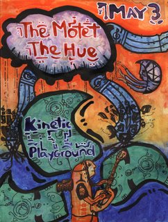
max kauffman, motet poster (*big ups to jans ingber who's father is a good buddy of my 'rents)
and lastly, i have to give a shout out to kauffman's great taste in music. a music lover, and a frequent adventurer into the world of live music, max sights the spontanaeity and constantly changing structure of live music as a great source of inspiration.
art research in today's day and age can be funny. more and more, artists who don't have the time or the resources to create a complicated personal website (kauffman's is currently under construction, though he has a charming and inviting start under his belt) rely on social networking sights like myspace and facebook to promote their art. the first time i had to go to an artist's myspace to get more info i felt like i was invading their privacy. mixed in with the straight forward shots of art pieces are party pics, personal anecdotes and commentary from friends. on action i find myself falling a bit in love with the artists that i look into, or at least find myself wanting to buy them a beer. max is no exception. seems like the kind of kid i'd like to hit up if i make it to summer camp this year (i'm on a mission with my buddy joseph to make it to a new festival each year in a state we haven't been to, and the midwest has plenty of states i haven't been to, and shows i've been meaning to catch). and i'll certainly go out of my way to see his art first hand next time he has a show in the NW.
kauffman recently finished up a solo show called "ghosts of industry" at push gallery in asheville, nc and has/had a show in april at andenken gallery in denver (where the artist is currently based). he has an impressive list of shows coming up in the next year including a june group show at seattle's halogen gallery (formerly suite 100 gallery) and a self-curated show in october '09 in chicago through oh no! doom.
Thursday, April 9, 2009

Thursday, March 26, 2009
urban 1028


i love patrick haemmerlein's work. it speaks, with a gritty urban voice, to the beauty of simplicity. not simplicity of composition, as haemmerlein's works are often explosive, multilayered mixed media melees, but simplicity of intention... clarity of verse, certainty of voice.
a move to los angeles in 2000 led to an "obsessive photographic cataloguing of the city" that created a foundation of imagery for haemmerlein's developing interest in graphic design (quote from artists' site). the artist is at LEAST a double threat with his superb photographic eye, and his ability to eloquently apply those images in more complicated, urban inspired designs (who knows, he might be an amazing character actor too. triple threat potential for sure). in most cases, rather than mining the depths of communal imagery, or worse, as some choose to, plundering other photographers' work and justifying the theft with a shield of "artistic license," haemmerlein produces his own imagery from the ground up. i have an enormous amount of respect for haemmerlein's multiple talents, and the seamless manner with which he integrates them.

above is an interesting side by side comparison from haemmerlein's site. on the left is the original photograph the artist took, and the right is the completed amalgamation. the photograph is lovely on its own, well composed, good lighting and direction of the subject. i love that the final piece is unexpected. the photograph is sort of softly glamorous, and while the design image retains the woman's engaging gaze, the composition takes on elements of toughness, disorientation and fantasy. the woman in the picture becomes a creature of the city, a natural urban native whose own body sprouts infrastructure.
the ny native's work is kinetic. the images leap from the page with youthful exuberance. behind the busy, often glutenous compositions are clear, concise messages of community, identity, and a call for compassion in the urban jungle. with a distinct graphic design aesthetic, haemmerlein's works read like headlines. they are bold, arresting and can elicit a gamut of emotions from shock to joy, and even that particular strain of shame that results from having the truth dumped in front of you and being forced to look it in the eye and acknowledge its presence.

haemmerlein has done many images, like the two above, that record in a sort of archaelogical manner the synthetic detritus of the living city. these works remind me of kevin cyr's cars and trucks, in that they imbue nonliving figures with personality, grace and a hint of nostalgia. i love that the compositions, though focusing on dominant machines, contain allusions to the city as its own ecosystem. small trees germinate from the underbellies of slick american motor vehicles, constant, persistent reminders of the natural world that we are all connected to; a mother nature that is too resilient to ever be fully buried under concrete.

haemmerlein's work is multilayered in several ways. the intended messages of the pieces are complex and easily open to various interpretations. the city is a system, and everyone has their place. a resident's reaction to the pieces of the city haemmerlein records will vary depending on which nitch that resident resides in. new comers to the city may still find their heart breaking at the sight of an earnest eyed homeless man with dreams in his stare, but those who have been exposed to the callousness for longer may already have their blinders on. for those who have (arguably) had to steel themselves to the ugly realities of urban life, these pieces might be pretty reminders of their helplessness and apathy. i love the above piece because it exemplifies the relationship between figure and environment in haemmerlein's work. in this piece the city skyline is dwarfed by a tree, next to which an elated figure dances in pure abandonment.
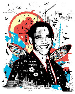
haemmerlein's pieces are physically and visually multilayered as well. each piece is carefully built up, either with layers of paper and media in his more painterly pieces, and with layers upon layers of text and imagery in his graphic design pieces. take for example the obama piece below. not only is the imagery rich and florid in its depth, but the words themselves "hope monger" are open ended. "monger" is a word that is most often understood as pejorative. in the complicated political climate of today's america, images such as this successfully speak to hope and jubilation while carefully reminding us of the importance of inquisitiveness and a constant questioning of the status quo.
Subscribe to:
Posts (Atom)